The Art of the Accent: How to Introduce 'Moody' Tones to Your Costa del Sol Villa.
In our previous post, we talked about the end of the "Sand and Wicker" era. We introduced the Moody Mediterranean—a shift toward deep olives, burnt ochres, and rich textures.
But at Superior Finishings, the most common concern we hear from homeowners in Marbella and Estepona is: "I love the look, but will it make my home feel too dark?"
It’s a fair question. Our Mediterranean light is some of the strongest in the world. If you use the wrong finish or the wrong tone, a moody colour can look "muddy" instead of "magnificent."
Here is how we at Superior Finishings bridge the gap between high-end drama and effortless light.
1. The 'North vs. South' Rule
On the Costa del Sol, the orientation of your room changes everything.
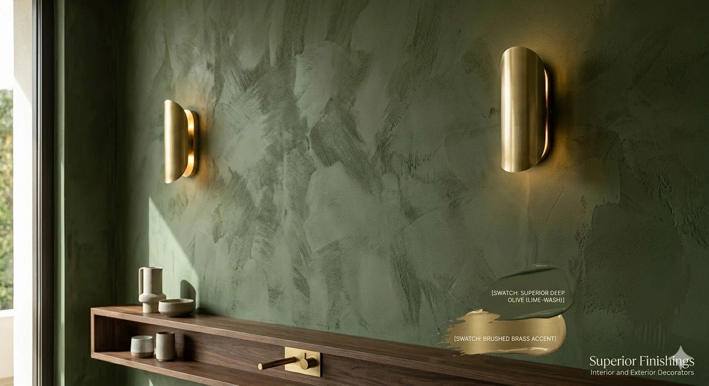
South-Facing Rooms: These get blasted with yellow, intense sun. Darker tones like Superior Midnight Blue or Forest Green actually absorb that glare, making the room feel cooler and more expensive.
North-Facing Rooms: These have a flatter, cooler light. Here, we recommend the "warmer" side of the moody palette—think Deep Terra Cotta or Dusty Rose Plasters—to inject warmth where the sun doesn't reach
2. Texture is the "Secret Sauce"
The reason beige became a "rut" is that it was often applied as a flat, boring matte. When we move into moody colours, Superior Finishings recommends using Lime-wash or Micro-cement finishes. Why? Because these finishes aren't one solid colour. They have "movement." As the sun moves across your room from morning to evening, a lime-washed Olive wall will change from a deep forest green to a soft, glowing sage. It breathes.
3. The "60-30-10" Balance
You don’t have to paint every wall charcoal to be "on-trend." We often advise our clients on the 60-30-10 rule:
60% Neutral: Keep your main flooring and two walls in a warm, updated white (like a soft linen).
30% Moody: This is where we come in. One significant feature wall, or perhaps your kitchen cabinetry, in a deep, saturated tone.
10% Accent: Your hardware—think the brushed brass or dark walnut we mentioned in our last post.
4. Don’t Forget the Exterior 'Fifth Wall'
In Spain, our terraces are our second living rooms. At Superior Finishings, we are increasingly seeing clients move away from "Stark Hospital White" exteriors. By using a Muted Stone or a Soft Clay finish on terrace accent walls, you reduce the eye-straining glare of the midday sun and create a seamless transition from your moody interior to your outdoor space.
Experience the 'Superior' Difference
Choosing a bold colour is a risk; executing it perfectly is a skill. At Superior Finishings, we don't just "slap on a coat of paint." We study the light in your home, provide samples that change with the day, and use premium materials designed to withstand the Andalusian climate.
"Visualizing how a deep olive or a moody blue will sit in your specific room can be a challenge. We recommend exploring the [Plan Home Color Database]—it’s an incredible tool that allows you to browse thousands of shades from top brands and see real-room comparisons. Once you’ve found a palette that speaks to you, Superior Finishings can provide the professional colour-matching and artisan textures to bring it to life."
Is it time to add some soul to your villa?